Xbox Vs PlayStation

Who is truly more valued in the gaming industry, Xbox or PlayStation? 

PlayStation - Released 3rd December 1994

Today thousands of people all ask this question and which they prefer "Xbox or PlayStation", This blog will contain looking at each of these consoles and naming their qualities and flaws. 
We start off firstly with the PlayStation 1, which was first onto the scene, Designed by Sony. It was released December 3rd 1994, urging parents and gamer's to buy this for Christmas. 


Sony PlayStation


Qualities: 

- Improved Graphics.
- New to the market. 
- Already had a huge fan base. 
- Until PlayStation Cartridges were used, PlayStation brought round the disc format to playing games. 


Flaws: 

- Its highly overpriced.
- Freezing and crashing became a problem. 
- scratched discs wouldn't work in the PlayStation. 
- Disc were very easily scratched. 
- Overheated easily.


PlayStation 2 - Released 4th March 2000

Then 6 years later the PlayStation 2 was born. March 4th 2000 began the new era of games and when this was released there was also other talks of a new console being brought out but not by Sony. Even a smaller lighter version of the PlayStation 2 was brought out called the "PlayStation Slim",(as seen on the right side of the image) The PlayStation 2 went on to become the best-selling video game console in history, selling over 155 million units. 

Even with the PlayStation 3 release, the PlayStation 2 remained popular well into the seventh generation and continued to be produced until January 4, 2013, when Sony finally announced that the PlayStation 2 had been discontinued after 12 years of production – one of the longest runs for a video game console.


(Left) PlayStation 2 (Right) PlayStation Slim

Qualities: 

- Sleek 
- Game genres and production of games increased. So more games to play 
- DVD movie playback function.  


Flaws:

- Still waiting for hard drive peripheral, 
- Xbox came along with superior graphics and stole limelight. 
- Only two controller ports, Xbox had 4


Xbox - Released 15th November 2001

Finally on the 15th November 2001, The first installment of the Xbox came into play, designed by Microsoft, this almost stole the limelight from the only recently new PlayStation 2. This console had high intentions of bettering Sony with 4 controller slots, Better graphics card and higher memory Capacity. By May 2006 it reached selling over 24 million units. 


Microsoft Xbox

Qualities: 

- 4 controller slots 
- Higher memory Capacity
- Better Graphics Card 
- Had the advantage of being a new model so this caught peoples eye. 


Flaws: 

- Overheated highly 
- Was a lot bigger and heavier then the PlayStation
- PlayStation 2 fans weren't keen on change so most stuck by the PlayStation. 
- The laser wasn't as powerful and didn't last long. 


Xbox 360 - Released 22nd November 2005

We reach the Xbox 360 which was finally released after many months of waiting on the 22nd of November 2005. With new and improved Online functions (Xbox Live) and better graphics and improved game play. The Xbox was really starting to make Sony look bad, seeing as the last console they released was back in March 2000. When the 360 was released we did hear an announcement about a newer console being developed by Sony and to be expect within a years time. The Xbox 360 surprisingly was announced by MTV which was great Publicity for Microsoft. and by October 2013 they sold 80 million units! 


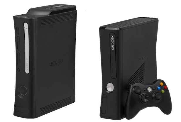
(Left) Microsoft Xbox 360, (Right) Microsoft Xbox Elite

Qualities: 

- Newer versions were brought out as seen in this image (Left Xbox 360, Right Xbox Elite) 
- Sold more units then expected 
- grew a huge fan base 
- improved fan to prevent crashing
- improved graphics 
- Wireless remotes


Flaws: 

- A new problem developed for the Xbox which was even given a name called "The Red Ring", when this happens the Xbox is unplayable. 
- overheated easily still. 
- The red ring issue was becoming increasingly common and this put people off buying an Xbox. 
- Constant updates for the system took game play time away and frustrated user. 


PlayStation 3 - Released 11th November 2006

PlayStation Knew they were under threat with the Xbox and by November 11th 2006, there answer back to the Xbox 360 was the new and reformed PlayStation 3. This console took a huge leap in technology as it was the first console to use Blu-Ray disc as its primary storage medium. Also with is unified online gaming service the PlayStation 3 in my opinion hit the home run. They also released once again a PlayStation Slim. 


Sony PlayStation 3

Qualities: 

- Improved graphics 
- Superior Online gaming 
- Blu-ray disc function 
- HD functions HDMI cable for improved graphics again.
- Wireless remotes 


Flaws: 

- Highly overpriced 
- Blu-ray laser wasn't great and needed to be fixed. 
- Some people say PlayStation 3 had worse graphics then the Xbox 360, but this is just opinion and many other support the PlayStation graphics too. 


PlayStation 4 - Released 15th November 2013

Probably the most anticipated console and this console came out with the 15th November 2013 with a lot of rivalry involved because this was the first time both Xbox and PlayStation were released so close together, just before the Christmas sales but there was war going on between these two companies (Sony and Microsoft) Both companies were trying to better each other in every way possible, Graphically, Design wise, Memory Capacity and even fan base. 

Sony PlayStation 4

Qualities: 

- Extremely improved graphics
- Online gaming refined 
- New functions on the remote control 
- Nice design. 
- Extension's build specifically for the PlayStation 4 e.g. Camera, Docking stations and many more. 

Flaws

- There has been reports of the PlayStation 4 freezing often while just in the "Menu" screen. 


Xbox One - Released 22nd November 2013

The Xbox One, released literally 7 days later then the PlayStation. The tensions between the two companies have never been higher, i could only imagine what the future holds for these two companies in constant conflict. i honestly cant judge which has better functions and which experience is better i want to leave that to you entirely. I will note and point out that the PlayStation is 100 euro cheaper then the Xbox One this might be encouraging more people to convert to PlayStation.

Microsoft Xbox One

Qualities: 

- Improved Graphics 
- Higher capacity 
- New remote control 
- Refined online gaming experience 
- Add-on's with the Xbox One package e.g. Headset, Keyboard for control etc.  


Flaws: 

- If you wanted to use, Netflix or even any online service the user would need to have a Gold Membership just to use the internet on there Xbox. 
- The first week the Xbox One was released the updates for it crashed the Xbox leaving it temporarily unusable. 
- Downloads and updates when first plugged in took over 10 hours or longer just to play 1 game.


The Verdict:

In conclusion, It's really up to the gamer him/herself to decide which is more fitting because even today fans are sticking by there consoles no matter what upgrades may come for the opposing maker (Sony or Microsoft) One can argue but there really is no superior gaming console, the graphics and game play will forever advance but i sense this rivalry will continue for some time too. 

The Evolution Of Gaming Graphics Since 1940

1940's   

The first Video game or earliest known interactive game was a missile simulator created by Thomas T. Goldsmith and Estle Ray Mann, inspired by radar displays from World War II . Screen overlays were used for targets since Graphics could not be drawn at the time. This game took off hugely and was highly spoken off when it was released. 

A few more game after this were released including the first ever tennis game, Chess, Tic Tac Toe and Space war.

Missile Simulator
Digital Chess

1970's

In 1972 we were introduced to a classical game Ping pong. It involved two remote controls to control sliding panels to rally a square boxed object. The aim of this game was to hit this square icon past the other players panel reach, you then score a point, it is just a computerized version of playing real Table Tennis.

A few more game after this were released including the first ever tennis game, Chess, Tic Tac Toe and Space war. 
People playing the original Pong game

1990's 

The 1990's showed a completely different path in the gaming world, graphics became more 3 Dimensional and games that we still have today were just at the beginning of there era's. We were also introduced into house hold gaming consoles, The PlayStation and the Game Boy.
Graphics were beginning to improve at a vast rate in this time period. Examples of Games in the 90's would be such as Ace combat, Need for Speed, Tekken, Resident Evil, Tom Clancy's - Rainbow six and many many more. The 3D graphics impressed millions across the world.


Range of classic 90's gaming characters


Tekken Game Graphics

2000's - Present day

In the years between 2000 and the present a lot of games created from the 1990's were carried on because of there vast fan base and this made these companies create sequels to the games for example today we still have the games Call of duty, Grand Theft auto, FIFA and Medal of Honor, these games were a huge hit when they first came onto the scene and this is probably what made them stick around in today's games, They continue each year to release another version of there game with a few changes and improvement in graphics, If you look at the very first image to the image below you can see the huge huge improvement on the graphics in gaming today and how big this society has grown.

Grand Theft Auto
Grand Theft Auto

Grand Theft Auto

The Future

Who knows what the future of game graphics holds but when we see Hollywood Actors like Ellen Page and Willem Dafoe appearing as actors captured through "performance capture" to literally embody the characters Nathan Hawkins and Jody Holmes in the recent game Beyond: Two Souls. While actors have lent their voices to games before – Liam Neeson appearing in Fallout 3, or Samuel L Jackson in Grand Theft Auto: San Andreas, for instance – this is one of the first times a fully acted performance has been captured, using technology similar to Andy Serkis's turn as Gollum in The Lord of the Rings. It is clear that it is onwards and upwards for the games industry.

Willem Dafoe and Ellen Page acting scenes for Beyond: Two Souls

UDK or Unity? Which is better?

By John Byrne


Here, I will be looking at the Pros and Cons of the Game Making programs UDK(Unreal Development Kit) and Unity.  UDK is made by Epic Games and is named for the Unreal series of games. Unity is made by Unity Technologies, specifically for Video Game development.


The platforms UDK can develop for are UDK: IOS, Mac, Windows (free version), Android, PS3, PSPVita, Xbox 360, WiiU. (licensed version) while Unity can develop games for IOS, Mac, Windows, Android, PS3, PSPVita, Xbox 360, WiiU.


Pros of UDK and Unity


UDK has more features than Unity, but needs a steeper learning curve to learn.The Unity Forums aren't as active as the UDK forums, UDK has a larger active user base. Unity can readily be used to make 2D as well as 3D games. There are a greater number of online tutorials for UDK. Unity has a number of large release in the mobile game sector. But UDK can develop for nearly every platform. The Unity program is stable, unlike UDK which crashes occasionally.


Cons of UDK and Unity


The licensed UDK engine cost a large amount, Unity can be improved with small paid updates that the user can regulate. UDK is more complicated then Unity, which is quick to learn. There is a problem with UDK crashing, even on high end computers. The Unity community is less active, so tutorials and guidance in using the program are lacking. Unity doesn't have the successes on consoles that UDK has had.


My Verdict:
With the larger amount of users that have created tutorials for it, UDK is the better program in my opinion. There is a better fallback if I struggle with something. And there is a wider range of what can be accomplished with it.

The Most Powerful Words In The English Language

Written by John Byrne, edited by Padraig Cahill


They often say, it's always the ones you least suspect, but in the case of the most powerful words, that certainly isn't true. These words appear everywhere in graphic design, marketing, branding and promotional material, with magazine covers particularly guilty. Throughout this article, magazine covers are used to show the most powerful words in action. In each example the powerful word under discussion is circled, although you will notice numerous powerful words in some covers. The example below has 7 of them in the one cover! At any time click on an image to view it full size. And now to the most powerful words...


Powerful Words Everywhere You Look

You 

'YOU' is the most powerful word in advertising for a reason - it's personal. "Let's talk about you", let's be honest, when it comes to you, you're all ears. If I make a promise to make people rich, you may be interested. If I promise to make 'YOU' rich, it becomes a different story. You is a word that must be used when talking to your customers, because that's who you're addressing. And when you do that, you're talking about a person's favourite subject. It's so powerful, many writers (especially in direct response) will not use a headline unless it has you in the title. Personally, I wouldn't go that far, but you is definitely something that 'YOU' should always consider. See examples below where the key word is circled.


Discover

This one is a prompt that advertisers use to say, "You're going to get something out of this, it's worth your time to keep reading." Or when it comes to product packaging, it indicates the product is worth checking out. Discover is a promise of something more to come. Like unwrapping a gift on your birthday, discoveries always bring a sense of excitement and adventure. And any time you evoke those fond childhood feelings, you're on to a winner. Personally I am nuts about adventure, excitement, new things. If the reader is too, the word Discover may work wonders. See examples below where the key word is circled.


Results

Another word used in the headline of this piece, results is a word that also means success. And this word is powerful because it's a promise that helps you rationalise the purchase. "Oh, well if this gets results, it must be worth it." If you "guarantee results" you've just upped the ante. We all want results, whether it's from a household cleaner, our bank manager or the President of the USA. If they deliver, you feel satisfied. If they don't, well, don't expect re-election. I suppose this is powerful because everyone wants results. Perhaps this is better in a back-to-back context? See examples below where the key word is circled.


Save          

'Save' or 'Saving' is an all time classic. And I think this one will work years after I have gone to my maker. Hands up if you don't want to save time or money... Exactly. Saving money is something that 99% of us want to do. Even the richest of the rich want deals, they just get them on more expensive purchases. If you can genuinely promise to save someone some money, you'd be foolish not to point this out. Of course, HOW you talk about it is just as important as what you're talking about. Do it wrong, and you will come across as either a pile-it-high-sell-it-cheap merchant, or untrustworthy. And as for saving time, well, time is money, which brings us right back to something we all want to save. See examples below where the key word is circled.


Health 

Especially powerful when it applies to a product. This is used a lot these days, and not just when talking about physical health. Perhaps the most commonly-used variation is "improve your financial health", and it works because we all know what good health is. If you can make a promise of good health, be it in a food, service or something else, you are doing well. But again, don't abuse the word. It is said to be especially powerful when it applies to a product or solution. Health is mostly effective against certain target markets. See examples below where the key word is circled.


New   

If I haven't heard about it before, never seen before, it's exciting! We all want new, even if it's not really all that new in reality. We want the next new phone model (which is why lines for the latest iPhone (see Trends in Mobile) span the block, despite having very few upgrades). We want new cars, new clothes, new shoes, new tastes, new smells, and we're willing to pay for it. Personally, I think NEW should be higher up on the list. It's a very powerful word that you will see in advertisements and promotions on a daily, if not hourly, basis from recipes to technology. See examples below where the key word is circled.


Proven

When selling anything, the word proven is a powerful one. It gives reassurance, nobody wants to be the guinea pig. Using the word proven in your marketing copy is proven to be effective! When you have a brand new product, not a new version of an existing product, there's a bump that you need to get over. It's basically "buyer beware," because the customer is dealing with an unknown. They can wait to see what the reviews on the product or service are, or they can ask friends and relatives. But one way to get over this bump is to provide the proof yourself. For instance, a famous cat food brand often used "8 out of 10 cat owners who expressed a preference said their cats preferred it". Wow, 8 out of 10. Must be good, it's proven. I'll try it. As Seen On TV products also do this well, with product demonstrations that prove a point. So, don't just say it. Prove it. See examples below where the key word is circled.


Easy  

Let's make this experience easy... Easy is better than hard. Who would choose a difficult option when an easier one is available? as long as the price/quality is just as good then easy is always better.


Love/Sex

This one has multiple meanings, you can be "in love" with something or you can "love" how well something works or performs. Either way, love is a strong word. But, be careful in its use. It's one thing to say "you're going to love the way it smells" when talking about a perfume. It's quite another to say "you will instantly fall in love with our toilet cleaner". Really? No one falls in love with a toilet cleaner. Remember, love may work well, but don't lay it on too thick. It can scare people away. 

There is another word starting with an S, three letters long, that I think is pretty powerful. Sex. But Sex can be come across as being a bit crude, however sexy is more acceptable and just as effective? Everyone wants to feel or be perceived as sexy. Play into that weakness and make it about them. See examples below where the key word is circled.


Now/Instant

Creating urgency is critical. We want things yesterday! The subject of delayed gratification is an important one among neuroscientists, as many famous studies showcase how being able to delay rewards to a later date is a skill needed to become successful. The reason this interests marketers is because it reveals an interesting aspect of human nature. This is an area where many business get too optimistic, and although it's smart to place an emphasis on these instant rewards, it's also always a good idea to under-promise and over-deliver, so be sure you can actually follow through on your promises or you may end up with a clan that hates your guts. See examples below where the key word is circled.


Free

The most powerful four letters in marketing. Nothing short of a conversion god, free never loses its power. Nothing free will be overlooked by anyone, what have they got to lose? When its free, nothing! So therefore they try it out. Simple. See examples below where the key word is circled.


How To Design A Logo

Learn how to create a logo by using the 5 basic principles in the area of logo design, collectively known as the principles of logo design; they state that a logo should be simple, memorable, appropriate, timeless and versatile. Each principles relates to a particular ideal of logo design and should be considered individually, however all the principles also relate to each other and it is when all the principles are used together that the best logos are created. If you came here looking for the principles of design then click HERE.
The 5 Principles Of Logo Design

Simple:

Simplicity is the most important of all the logo design principles. Logos can appear in various places and in various sizes such as small emblems on t-shirts or as iconic symbols on billboards. It is because of this that they need to be clear and simple so that they still display correctly and effectively at any size. Logos are designed as vector graphics to ensure they retain their image quality at any size but it is just as important that they retain their overall clarity as well. By keeping you logo simple you are ensuring that at any size it will be easy to identify and read. In this way, a logo should really only contain a single graphic and a small amount of text. Prime example of simple logo are the Nike 'swoosh' and the Apple 'apple'. They are clearly identifiable at any size and even work without any text as seen below.

Simple Apple Logo 
Simple Nike Logo


Memorable:

There are 3 stages to making a logo memorable. To make a logo memorable you must first ensure it is simple. Like anything, the simpler it is the easier it is to remember, it is no different with logos. The second key element to making a logo memorable is to make it as original as possible, if something is unique or different people tend to remember it and it will be set apart from other similar businesses, products or services. The originiality of the logo can be achieved through elements such as interesting fonts, unique shapes, bright colours or a catchy tag line. The images below both use bright colours, interesting and unique forms and shapes which themselves create original lettering. The third stage to making a logo memorable is to make it relative or appropriate to the business, product or service it is representing. This is discussed in more depth in the next section.

Madrid 2020 Logo Memorable Due To It's Originality

Memorably Creative Vividways Logo

Appropriate:

When designing a logo you must consider the business, product or service that the logo is representing. You cannot design in any style or using any fonts or colours that you want. Every logo is different and requires a different approach, an approach that is appropriate to the business, product or service it is representing. To give an example a logo for a solicitor should ideally be clean and linear with a mono or two toned colour scheme to represent the serious and professional nature of the service being offered. On the other hand bright colours, quirky fonts and curved lines would not be suitable for a solicitor, however they would be suited to a toy store or playschool to represent the fun nature of the business. An appropriate graphic, such as a house for an auctioneer, also helps to immediately associate the product or service being offered with the name of the business which by itself may not suggest a specific product/service. For example a local business called after the owner, lets says 'Smiths' does not in itself suggest any particular product/service that is why an appropriate graphic is necessary. An appropriate graphic is also vital for new businesses to help consumers to identify with them and their logo while they are still in the process of marketing their company identity.

This Solicitors Logo Is Appropriately Clean Lined & Serious Looking

The Colourful Toy Я Us Logo Is Appropriately Fun & Quirky

Timeless:

A company can be in business for months, years, decades or even centuries; therefore it needs a logo that will stand the test of time and not 'age' badly. A logo may be tweaked or updated slightly over time but it should not require a full overhaul as that would mean the company would have to spend lots of money remarketing its new identity, which can be a very expensive process, especially for large companies. Public bodies or services also require logos and as they cannot go out of business they tend to be around for a long time and thus need a timeless logo design, the London underground logo is a classic example of this. It is a simple design using basic shapes, primary colours and clean, simple text. As previously mentioned, all the logo design principles link together and it is evident in the London Underground logo as it is because of it's simple and appropriate style that it has remained unchanged for so long. The Coca Cola logo, the Olympic logo and numerous car company logos such as Toyota ,Ford, Volkswagen and Mercedes are other examples of timeless logos which have remained unchanged for decades.


Olympic Logo Is Iconic & Timeless

London Underground Logo Unchanged Since 1908

Versatile:

A versatile logo is one that will work equally well at any size and in any colour scheme. The logo must first be simple in order for it to have the potential to be versatile, again reinforcing simplicity as the key logo design principle. The best way to achieve a versatile logo is to first design in black and white, as if the logo works in black and white it will most likely work in any suitable colour scheme. See the example of the Apple logo below.


Apple Logo Showing It's Versatility


Now You're Ready To Create The Logo...

Once you have used the logo design principles above to actually plan out and design your logo on paper the next step is to actually create the logo as a vector graphic using a software such as Illustrator or Photoshop. Well, we have you covered there too with this illustrator logo design tutorial. We hope you find it useful.