How to use UV Mapping in Blender


Finished UV Mapping

What is UV Mapping?

UV Mapping is a process used in 3D Modelling, to simulate the surface of a 3D object using a 2D image. A 2D diagram or “UV Map” of the 3D Object is created to know where on the image each part of the object is, and where you put a texture on the object. Credit to Darrin Lile for supplying files used for tutorial at www.darrinlile.com

Why use it?

UV mapping is used when you want to put multiple colours/textures onto one mesh. The object is split up into different parts on a map, allowing it to be textured one part at a time.


How-to

Step One:Start up the file with the object you want to UV map or create a new object.

Unmapped mayonnaise bottle

Step Two:Select the Object by right clicking and go into edit mode (TAB). Select the Shading/UV’s tab on the far left by left clicking it.

Shading/UVs panel
Set your selection preference to edges (middle) underneath the stageand select edges suitable to be a seam (normally outer edges or where the shape bends) by Alt+Shift clicking them to get the full edge, and to select multiple edges like so:

Selecting edges of object
Then click “Mark Seam” under UVs in the left toolbar.

Step Three: right click the grey line between the stage and border at the top of the screen and select “Split area"

Split Area


Obviously you don’t need two of the same screen, so in the bottom left of which ever one you want, click the little box shown below and select “UV/Image editor”.

Editor Type select

This will make the stage look like this:

UV Editor area
if you use the same file as me this window will already be open and you won't have to do this part.

Step Four:in the stage that still shows the object, press A until everything is highlighted in yellow. Then press U and click “Unwrap” different parts of the object (separated by the seams) will then appear in the second stage.

UV Map of an object in Blender
UV Map
You then click the UVs tab underneath the UV editor stage (right side of image above) and click “export UV” layout and save it where you want.

"UVs" menu

Step Five: open the .png you just saved of the UV map in Photoshop (or MS paint) using File>Open and finding the file. 

file open

Start a new layer, underneath the UV map’s layer and paint the shapes whichever way you want. To know which shape you’re painting, go back into blender, change the edge selection to face selection and in the stage displaying the object select a face. It will then highlight in the UV editor stage, letting you know which part is where on the UV map. When painting the object in Photoshop it is not necessary to paint outside the shapes of the UV map, and if you do it will not affect the texture when it is mapped onto the object at all. when saving the file make sure that the colour layer is above the UV map layer. The end product should look something like this:

UV Map Layer
finished painting of map

Step Six:After you save over the UV map .png with your newly edited one, go back into blender. Make sure everything is highlighted in the object stage and if it isn’t hover over it and click A. change “blender render” to “cycles render” above the stage next to the version then  in the right toolbar click the material bar and click “new material” as shown below.

Adding a Material

Then, on the stage that we changed to the UV editor, click the little box we used to change it again and select “Node editor” which will give you the screen below.

Node Editor

Click “Add” underneath this new stage, and select Texture>Image texture. Connect the yellow colour circle on the new box to the yellow colour circle on the diffuse box. Then click open and find the new UV map we created.

image added to Node Editor

With the correct lighting and camera placement, when you view the rendered image by pressing F12, you should come out with something like this:

finished UV mapped object

As you can see from the preview above, UV mapping allowed me to use multiple colours and textures for this bottle of mustard including the yellow, red and even the texture of the label. This can be used from something as simple as this static mesh, to an entire character for a game. Enjoy practising it out.

How to use Boolean Modifiers in Blender

Four types of Boolean modifiers shown
Four types of Boolean Modifiers on display.

In this quick tutorial you will be learning how to use the Boolean modifier in blender and what each operation does, but first;

What is a Boolean modifier?

A Boolean modifier is a tool within blender which allows you to use two different shapes to affect each other in a number of ways to create new shapes. It allows you to combine, subtract and intersect the two shapes . These three options give you four different types of shapes (as you can have an A-B or B-A subtraction) you can make using the Boolean modifier as shown above.


Step One:Open up a new file.

New file


Step Two:Add a UV sphere (Shift + A and find it in meshes) to the centre of the cube. Scale it up (S key) to look like below. Then shift and right click the cube so you have both of them selected and then duplicate them three times (Shift + D).

Four copies of the sphere inside the cube


Step Three: Select the first cube by right clicking and click the wrench in the toolbar on the right. After that click “Add modifier” and select Boolean (shortcut for Boolean in this menu is N so you can press that to save you from looking through all the options).

How to bring up the Boolean Modifier menu


Step Four:The first modifier is union. Select “union” under operation then under “object” select which ever sphere is inside the cube. You can find out the name of the sphere by right clicking it on the stage. The name will appear in the same place it says “Cube.003” below. If you are following this tutorial exactly, then the shape numbers will correspond e.g. Cube.003 will have Sphere.003 inside it and Cube.001 will have Sphere.001 inside etc. You then hit apply and can now delete the sphere by right clicking it and pressing X and clicking delete. The shape will look like the same as before but will have no internal geometry. (You can see this by hitting the Z button to go into wire frame mode).


No internal geometry when union Boolean operation is used.


Step Five:Select the next cube by right clicking and do all of the same things but this time instead of selecting “Union” in operation select “difference”. Out of the three different operations this is the only one that can have two different types of shapes made from it, depending on which shape you apply the modifier to. This operation takes one shape away from another. When you click apply and delete the sphere the shape should look like this:

Difference A Boolean operation shown

Step Six:Again, we will be doing the same thing, but this time, with the next two shapes, select the sphere. Apply the difference operation and delete the cube and the result should be the exact opposite as the first, shown below:

Difference B Boolean operation shown


Step Seven:The final operation is intersect. Select the cube and follow the same procedures as before but under the operation drop box select intersect. Apply and delete the sphere and the shape left over should be the one shown below. This operation only shows geometry where the two shapes' geometry were on top of one another.

Intersect Boolean operation shown

If done correctly, you will have the four shapes on your stage as shown at the top of the tutorial. These modifiers are used to create shapes which are otherwise not available to use through the meshes given by default. If you feel confident in knowing how to apply the Boolean modifier play around with it. you can use different shapes, place them differently, maybe even use more than two shapes. The possibilities are endless.

10 Cool CSS Image Effects


This Article outlines 10 excellent image effects for your website that can all be easily achieved using just plain old HTML and CSS. The image above shows just 3 of the effects that can be created, others included the Polaroid image effect, creating circular or elliptical images and even stacking multiple image on top of each other. The effects are listed in order of difficulty (in my opinion), so perhaps start with the first one and progress from there.


Image Rotation:


The HTML


The CSS

div.rotate  
{
-ms-transform: rotate(7deg); /* IE 9 */
-webkit-transform: rotate(7deg); /* Chrome, Safari, Opera */
transform: rotate(7deg);
}


Border With Drop Shadow:


The HTML


The CSS

div.shadow 
{
-moz-box-shadow: 10px 10px 5px #888888;
-webkit-box-shadow: 10px 10px 5px #888888;
box-shadow: 10px 10px 5px #888888;
border:15px solid #ffffcc;
}


Layered / Stacked Images:


The HTML


The CSS

div.box1
{
z-index:1;
position:relative;
-webkit-transform: rotate(-3deg);
-ms-transform: rotate(-3deg);
-o-transform: rotate(-3deg);
transform: rotate(-3deg);
}

div.box2
{
z-index:2;
position:relative;
left:-150px;
}

div.box3
{
z-index:3;
position:relative;
left:-350px;
-webkit-transform: rotate(3deg);
-ms-transform: rotate(3deg);
-o-transform: rotate(3deg);
transform: rotate(3deg);
}

Circular Images Effect:


In the examples above the image is 200px high and wide with a border-radius of 100px. The key to creating circles is for the border radius to be half of the height and width.

CSS

img{border-radius:100px; height:200px; width:200px;}


Elliptical Images Effect:


In the examples above each box is 200px high and 300px wide with a border-radius of 50%. The key to creating ellipses is for the border radius to be 50%.

CSS

img{border-radius:50%; height:200px; width:300px;}


Polaroid Image Effect:


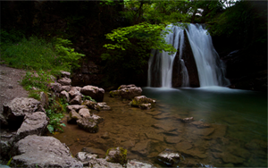
Waterfall Photo

The HTML


The CSS

.polaroid 
{
position: relative; text-align: center;
}

.polaroid img
{
border: 10px solid #fff;
border-bottom: 45px solid #fff;
-webkit-box-shadow: 0px 0px 10px #777;
-moz-box-shadow: 0px 0px 10px #777;
box-shadow: 0px 0px 10px #777;
-webkit-transform: rotate (3deg);
-moz-transform: rotate (3deg);
transform: rotate (3deg);
}

.polaroid p
{
position: absolute;
text-align: center;
width: 100%;
bottom: 0px;
font: 400 18px/1 'Kaushan Script', cursive;
color: #888;
z-index:99; }


Description On Hover:


⇧ Description

Lorem ipsum dolor sit amet, consectetur adipiscing elit. Suspendisse vel commodo turpis. Cras et congue justo. Nullam rhoncus commodo tellus, eget fringilla lacus pellentesque et.


The HTML


The CSS

.image
{
overflow:hidden;
width:auto;
height:240px; /*should match your images height*/
}

.image-desc
{
text-align:justify;
position:relative;
top:-40px; /*allows the first part of the description to be visible*/
overflow: hidden;
font-size:14px;
padding:10px;
height: 200px;
color: #ffffff;
background-color: #000066;
opacity: 0.8;}

.image-desc:hover
{
position: relative;
top:-187px;
opacity: 0.8;
}


Map Pin Effect:


The HTML


The CSS

div.rotate  
{
.pin
{
z-index:2;
position:relative;
top:18px;
left:0px;
}

.photo
{
z-index:1;
position:relative;
}

}


Paper Clip Effect:

The HTML


The CSS

 
{
.paper-clip
{
z-index:2;
position:relative;
top:18px;
left:5px;
}

.photo
{
z-index:1;
position:relative;
}

}

Masking Tape Effect:


The HTML


The CSS

 
{
.tape
{
z-index:2;
position:relative;
top:18px;
left:5px;
}

.photo
{
z-index:1;
position:relative;
}

}

CSS3 Media Queries For A Responsive Website Template

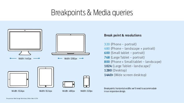
Common device breakpoints


At this point you have probably already heard about responsive web design and how every website needs to compatible to work well and look good across multiple devices. If so, you heard right!

With a @media query, you can write different CSS code for different screen sizes or for different devices, which is very useful when making web pages with responsive design. You can also have different layout when a user resizes a browser window up or down to a certain width, or height.

Responsive web design is vital for any web project and CSS media queries are vital for a successful responsive website. So to make things a little easier for you here are all the main CSS media queries need for a responsive website.


CSS Media Queries For a Responsive Website


/*Responsive Styles*/


/* Smartphones (portrait) ---------------- */
@media only screen
and (max-width : 320px)
{
/* Add Your CSS Styling Here */
}

/* Smartphones (landscape) ---------------- */
@media only screen
and (min-width : 321px)
and (max-width : 767px)
{
/* Add Your CSS Styling Here */
}

/* Tablets (portrait) -------------------- */
@media only screen
and (min-device-width : 768px)
and (max-device-width : 1024px)
and (orientation : portrait)
{
/* Add Your CSS Styling Here */
}


/* Tablets (landscape) ------------------- */
@media only screen
and (min-device-width : 768px)
and (max-device-width : 1024px)
and (orientation : landscape)
{
/* Add Your CSS Styling Here */
}

/* Old Desktops and laptops ------------------ */
@media only screen
and (min-width : 1025px)
{
/* Add Your CSS Styling Here */
}

/* Desktops ------------------ */
@media only screen
and (min-width : 1201px)
{
/* Add Your CSS Styling Here */
}


By inserting the relevant CSS code in each section you can have elements of your web page responding to the screen size or device orientation of your user.

More web tips,templates and tutorials coming soon as part of our "month of web" at OnlineDesignTeacher. Follow us on Twitter and Facebook to be sure you don't miss out.

3 Uses For CSS3 Border-Radius

As part of the month of web at OnlineDesignTeacher we are going to look at 3 good uses for the CSS border-radius tag. First off the obvious one....

Border-Radius For Rounded Edges

In the examples above each box is 200px high and wide. The first box has a border-radius of 10px, the second has 15px and the third 20px.

#box1{background:#660000; border-radius:5px; height:100px; width:100px}

#box2{background:#660000; border-radius:5px; height:100px; width:100px}

#box2{background:#660000; border-radius:5px; height:100px; width:100px}

So that's the basic one, now for the more interesting effects...


Border-Radius Creates Circles


In the examples above each box is 200px high and wide with a border-radius of 100px. The key to creating circles is for the border radius to be half of the height and width.

#box1{background:#660000; border-radius:100px;height:200px; width:200px;}

img{border-radius:100px; height:200px; width:200px;}


Border-Radius Creates Ellipses


In the examples above each box is 200px high and 300px wide with a border-radius of 50%. The key to creating ellipses is for the border radius to be 50%.

img{border-radius:50%; height:200px; width:300px;}


More web tips,templates and tutorials coming soon as part of our "month of web" at OnlineDesignTeacher. Follow us on Twitter and Facebook to be sure you don't miss out.