How To Create Professional 2D Games

This is an interactive guide to creating 2D games. Use the arrow keys to go forwards and backwards between slides.

Notes and Credits:
Music is made by @fredmaster45 and @BlazinDevilify
Guide by TM

How to create a flying 2D game character

Before we explain how to create your flying 2D game character, lets try it out. Press the green flag to start, use the arrow keys to control the player.

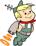
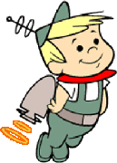
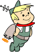
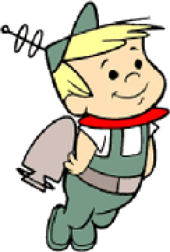
To create the illusion of your 2D game character flying you will need to fist create the character costumes. In this example, the character has been given a jet-pack so to create the illusion of a working jet-pack which is powering his flight a series of costumes, each with increasing power from the jet-pack were created to suggest a burst of fuel/power into the jet-pack. See below.


In this example, I will be using the 2D game engine Scratch (free to use) to programme the character but don't worry is you use a different game engine as the principles are  basically the same.

Firstly you will need to create to create 2 variables, 1 for the  characters speed on the x-axis and 1 for the characters speed on the y-axis. You can call them anything you want but ideally use something obvious such as "x speed" and "y speed". These variables can then be used in the programming code to create a realistic sense of gravity.

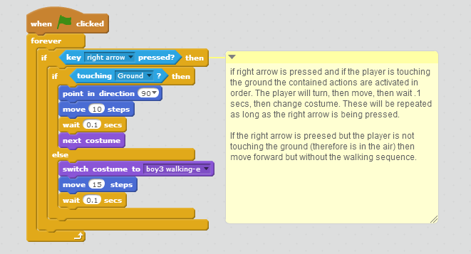
All the snippets of code below are explained in their captions and how they relate to the overall flying process.

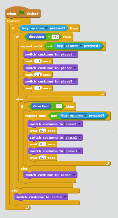
This code toggles through the costumes when the up arrow is pressed


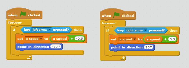
This code uses the x speed variable to speed/slow the character when the left or right arrows are pressed

And finally the gravity creating code...

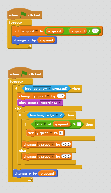
This code creates the illusion of gravity at the outset and then relates to it
 as the up arrow is pressed, representing the jet-pack being powered

Why not try it yourself, you can remix and edit the project here.

Sample Character For 2D Game

Click the green flag to start. Use arrows keys to make the character walk and jump.


This character was made and programmed using Scratch, but the principles are the same for most other 2D Game engines. See the code below to understand how the character movements are programmed.


This code controls the right arrow key, the process is the same only opposite for the left arrow

This is the code for the up arrow

The costumes referenced in the above code examples are these character costumes...


Between the programming code and the character costumes a basic sense of a moving character can be created.


How To Create A Character Walk Cycle

In 2 Dimensional games and animations the illusion of motion is created by carefully sequencing slightly different still images at a speed quick enough, where the human eye will fill in the gaps between. This is usually 24 fps (frames per second).

Here's an example, the 5 images below are all still images, but when they are programmed to change quickly the character appears to walk, especially when a forward motion is added.


This is a basic sample (below) showing how character costumes can be created and arranged to simulate movement in a 2D game. Press the green flag to start.


The motion is created by this block of logical programming along with the character costumes shown above.

programming code for the sample animation above

Rendering in 3D

A  Photorealistic 3D Rendering

Following on from our previous articles on the 3D Modellinglightingmaterials and textures and animation we now finish our 5 part series with a look at 3D Rendering.

In 3D graphics rendering means the calculation of the final image from the scene that includes models, textures, lights, special effects and cameras. The final image will be a 2D image made of pixels. Utilizing materials, lighting techniques, and renderer's settings one can render multitude of different images from a single 3D scene. Often the goal is to produce realistic rendering, for example in live action movies the goal is to render 3D effects as realistically as possible as it is a cheaper and easier alternative to building sets or hiring extras for a scene.


Photo Realistic Rendering:

Photo Realistic Render of 3D Diamonds

With technology continuing to improve at a rapid rate renders from 3D sofwares are becoming more and more realistic. The ability to apply and map bitmap texture images is a big part of this realism but the key to real photorealism is generally attention to detail when lighting the scene but lighting a scene realistically is also one of the most challenging aspects of producing photorealistic renderings. If you haven't already, please see the article of the basics of 3D lighting types to help you get started.


Clay Model Rendering:

A Clay Render of a 3D Model
When 3D modeler's present their modelling skills they often produce a clay render. Clay render means a rendering which looks like a picture of a clay model. The idea of a clay render is to bring out the form of the model. This is not really a rendered effect however as it is generally the default form of a non textured model or a model without materials. However good lighting is necessary to effectively showcase a model in a clay style render.

Wireframe Rendering:

A Wireframe Render of a 3D Model
The purpose of wire rendering is to reveal the polygon structure of the model. Wire rendering displays only edges of the polygons. Wire render and clay render are often combined.

Cell Shading / NPR Rendering:

A Cell Shading Render
Cell Shading is a from of Non-photorealistic rendering (NPR). In contrast to traditional computer graphics, which has focused on photorealism, NPR is inspired by artistic styles such as paintingdrawingtechnical illustration, and animated cartoons and focuses on enabling a wide variety of expressive styles for digital art. NPR has appeared in movies and video games in the form of "cartoon shading", as well as in architectural illustration and experimental animation. An example of a modern use of NPR is that of cell-shaded animation as seen above. Another form of NPR is cartoon style rendering means a material / rendering method that produces an image that looks like a hand drawn picture.

Rendering Tutorials:


Basics of 3D Animation

Following on from our previous articles on the basics of 3D Modelling, the basics of 3D lighting and 3D materials and textures we now continue on to look at the basics of 3D Animation.


3D Character and Animation
Computer animation is essentially a digital successor to the stop motion techniques used in traditional animation with 3D models and frame-by-frame animation of 2D illustrations. 3D animations are more controllable than other more physically based processes, such as constructing miniatures for effects shots or hiring extras for crowd scenes, and because it allows the creation of images that would not be feasible using any other technology. It can also allow a single graphic artist to produce such content without the use of actors, expensive set pieces, or props.
Creation of 3D character animation is a very complicated process which consists of four separate steps:
  • Modelling the character
  • Rigging the character
  • Skinning the character
  • Animating the character

Modelling the character

Views of a 3D Character Model
A character, especially a realistic one is one of the most challenging subjects to model believably. If a character is going to be animated, the task is even more challenging. When creating 3D models which are going to be deformed (such as a human hand), one must be extra careful when defining the structure of the surface. The structure (orientation and type of polygons) of the 3D model defines how well it is suited for an animation.

Rigging the character

Rigging A Character Face

Character rigging means a process of creating the bone structure for a character. The bone structure is a set of helper objects that correspond to bones in real life. The bones (helper objects) will be animated and the character will move and deform accordingly. Bones itself won't show in the final rendered image.


Skinning the character

Skinning a 3D Character Model
Character skinning means the process of defining how exactly the character responds to the movement of the bones. In skinning process one goes through all the joints in the bone structure and carefully adjusts how the 3D model deforms while a certain bone is moving. As an addition to bones there are also other special tools and modifiers designed to help in character animation. For example facial animation is often carried out by morphing the face between several predefined states.

Animating the character

Animating a 3D Character Model
The last step in character animation is the animating itself. Animating requires a lot of skill and practice. An animator should understand at least the basics of character movement such as the concept of anticipation. Character animation process can be fluid when rigging and skinning are done with care. For 3D animations, objects are modelled and 3D figures are rigged with a virtual skeleton. Then the limbs, eyes, mouth, clothes, etc. of the figure are moved by the animator on key frames. The differences in appearance between key frames are automatically calculated by the computer in a process known as tweening or morphing. Finally, the animation is rendered.
For 3D animations, all frames must be rendered after the modelling is complete. For pre-recorded presentations, the rendered frames are transferred to a different format or medium, such as film or digital video. The frames may also be rendered in real time as they are presented to the end-user audience.
Next up in the 3D Modelling and Animation series is the final stage, 3D Rendering.

10 Reasons Why You Should Use Blogger To Create Your Website

 Google Took Over Blogger In 2003
Blogger is for creating Blogs not websites, right...? Wrong! Although it may have started out that way, in fact it definitely started out that way, Blogger is now an extremely effective tool to easily and freely create full blown websites. If you don't believe me look at this website which was created using Blogger - you wouldn't think it, would you!

Just like Wordpress it is also an excellent Content Management System (CMS) tool which is just one of the many reasons why web designers should be using it. Unlike Wordpress it is totalIy free with no hosting costs and a free sub-domain name given, there is also no charges or fees for using plugins or connecting to a custom domain. I use it regularly and there are really very few situations where it is not capable of meeting the needs of a client and more often than not it is a better, or at least simpler, option for both me and the client. So before I give away everything in the introduction and here's 10 reasons why Blogger is great for creating websites.


1 - Blogger Is Free

It's free, totally free, no hosting cost, free sub-domain name provided and is therefore cheaper than everything else. The sub-domain name provided will be yourwebsite.blogspot.com which is fine for a blog but for a professional website it doesn't quite cut it right? Well that brings me to my next point...

2 - Easy Custom Domain Integration

You cannot purchase a domain name directly through Blogger but you can connect your blogger website with any domain name in a few simple steps, Blogger are even kind enough to provide you with instructions. The old .blogspot address will also redirect to the new domain with the content from your blogger website being displayed under your chosen domain without a visitor being any the wiser. Search engines will use the custom domain name to index the site, meaning it appears as a fully fledged professional website and not a run of the mill Blog.

3 - Free Unlimited Hosting

Although domain names are generally quite cheap, as low as $5 for an annual .com license, hosting on the other hand is not as cheap. I have seen hosting costs range anywhere from $50 to $500 a year depending on the amount of space, level of security and other features that a client can require. Blogger, as already mentioned, has no hosting costs. Where's the catch you ask? One that used to stop me from using Blogger was that it does not support PHP. But nowadays for contact forms and other standard PHP things there are ways around it such as using JotForm to create and host your form, then embedding it into your Blogger site. Another big one that used to be a problem was that there used to be a limit of 20 static pages per site, but that has since been removed, so there is now unlimited space available which most paid hosting services can't offer. How is this possible you ask, well that brings us nicely to the next point.

4 - Its Run By Google 

Blogger is part of the Google family so you are guaranteed a quality and reliable service. But returning to the previous point about storage what a blogger account also gives you is a Google account and with that comes lots of other free stuff. You see when you set up your Blog you will need to create an account, which is actually a Google account (unless you already had one of course) and therefore you simultaneously set up a YouTube account, a Google Drive account, a Google + account, a Gmail account, a Google Calendar account, a Google Places account and much more besides. All of these tools can be used to expand the possibilities for your Blogger website like storing documents (Google Drive), hosting videos (YouTube), arranging or displaying events (Google Calendar) or literally putting your business on the map (Google Maps).

5 - Easier SEO

Within Blogger you can also label your blog posts with keywords and submit a specific description to be used by search engines while indexing your website. As a Google product it is also very well coded and hosted on a Google owned server so speed performance is usually very good. As mentioned above a blogger account comes hand in hand with a Google account and 2 more SEO related tools called Google Webmaster and Google Analytics. Google webmaster allows you to index your Blogger website in the Google search listings and then control various aspects of that listing such as geographic targeting, robots.txt and sitemap.xml settings all the while receiving basic data about your websites performance. Google analytics takes performance data to the next level and allows you to monitor every conceivable detail about your websites performance. 


6 - Easy To Learn & Use

Blogger is genuinely easy to learn and easy to use. It took me about 30 mins to get up to speed with all the main features of Blogger and I honestly could not say the same for Wordpress, although that may say more about me as Wordpress isn't popular for no reason. But i'm entitled to my opinion, and my opinion is that Blogger is easier to use than Wordpress. There are also a wide selection of templates built in to help get you started as well as thousands available for free online from very talented and generous web designers. The layout is clean and simple with the ability to drag and drop the default sections around as the numerous widgets which can then be added to personalise your website.

7 - Loads Of Gadgets 

There are a wide selection of gadgets within Blogger that can be added to the default header, body, footer sections. Things like site search, follow by e-mail and Ad-sense can simply be selected, edited to suit your needs and then dragged and dropped into the site layout as you see fit. As well as these relatively standard gadgets there is one gadget simply called the HTML/JavaScript Gadget. If you are a web designer or coder and feel restricted by all the templates and standard gadgets this simply allows you to code anything at all to appear in your website. I use it mainly for slideshows and custom menus.

8 - More Than Just Templates

The 'customise' section within Blogger allows you to customise all the default elements of your website, on desktop or mobile, using a WYSIWYG system so even without any coding knowledge you can still personalise your website to the way you want it. As I touched on in the previous point if you don't like templates and standard web gadgets you can still edit the site H.T.M.L. and C.S.S. code of your Blogger website directly to create a unique and original design or just to tweak an existing template or gadget. Within the HTML code there are even 'conditional' sections such as (without the HTML to avoid confusion), if displaying on a mobile device then do x, y and z. This makes it really easy to customise the look of the mobile site option, which I just realised I forgot to mention as another great built in feature of Blogger websites!


9 - Can Be Used As A CMS 

This point is really only relevant for web designers/developers. For me and any web designer who already knows how to code a website from scratch anyway one would think that Blogger did not hold much appeal however, the fact that a Blogger website is easy for a client to update the pages after you have designed them and therefore lends itself very well to being used as a Content Management System. A client simply needs to log into a Google account connected, through the Blogs settings, to the website and on each page of the website they will then see little wrench icons at the bottom of each section. They can then click on the icon and use the pop up editor to make the changes they need. The editor is very similar to editing a word document as well as allowing the insertion of videos, images and links with relative ease. So if the client has basic computer skills then they should be fine. It can;t get much simpler than that! And if a client is a little more tech savvy then they can just used the Blogger system directly to edit the website in the same way that you set it up.  

*If you skimmed through and noticed only 9 headings you'll have to read through to discover the hidden 10th reason included in one of the sections - I say hidden but I only remember it as I was writing the article ;)

The Evolution of Web Design

Responsive Web Design Is Growing Increasingly Popular
I recently redesigned websites for 2 clients, coincidentally enough both were located in the same area and both worked in the same sector (timber products). Both also had existing websites that needed overhauling but what was even stranger was what I discovered while doing my preparatory research. Both companies still had their very first websites online, (separate to their more current ones); they were both a major blast from the past with one right from the very early days of the internet in the mid 1990's, almost 20 years old! 

It was amazing to see how far web design has come in the past 20 years and I thought I just had to share. While browsing through the old websites I noticed some major differences between websites now and then, which I feel perfectly demonstrate the evolution of web design in the past 20 years. Here's the low down...


Image Quality

Poor image quality visible in old website image

What passed for acceptable image quality in the early days of web design was a lot lower than today but we have to remember that digital cameras were not commonplace until the late 1990's. This meant that a lot of images online were initially taken on a film camera before being scanned into a computer in order to be digitized. And even when digital cameras were being used to take picture the megapixel quality was generally only 1 megapixel or even lower!


Mailto link Vrs. Contact Form


Sample of Contemporary Contact Form 
I had almost forgotten about the old mailto link, which was once the standard for contacting someone online via a website link. The mailto link allows users clicking a link in a website to send an e-mail without first having to copy the destination e-mail address and open an e-mail client. Test a sample mailto link here. Send Mail

It is now generally obsolete, mainly due to it's vulnerability to robotic address harvesting resulting in the spamming of the specified email address.

Online forms are now the standard for allowing website visitors to contact a company or make orders online. They are much more secure than a mailto link as the email address is not in the actual HTML code but rather stored in another file, generally PHP, on the websites server.

On the left is the contact form on the new website which includes features such as form verification to check validity of content like phone numbers and email addresses as well as ensuring all required content is included. All of these features are of course now standard in website contact forms.


Static Menu Vrs. Dynamic Menu


Old Website Menu Creating Using an Image Map

Modern Website Menu Created using HTML Text and CSS Effects Only

Back in the early days of web design there was no a:hover scripts or drop down menus used and in order to create a menu which would stand out web designers used a single static banner and menu image which was then converted into usable hyperlinks using html image map coordinates. The image map technique is no longer used for menus, possibly due to their inability to be indexed in search engine results as well as images being slower to load than a menu made up of html text and css effects. Image maps are not obsolete however, and there is still a use for them in certain situations.


Single Images Vrs. Image Galleries


Sample Image Gallery From New Website

Scripts for image galleries, especially ones with transition effects, are admittedly complicated but thanks to the hard work of lots of talented (and generous) programmers there are now a wide variety of freely available image gallery scripts in a variety of coding languages. However, this of course was not the case back in the early days of the internet and our old website was a prime example where an image gallery would have been ideal but rather 4 separate pages, as seen below, with lists of images were used instead. (click on an image to view full size)


Static Map Vrs. Google Maps


This Static Map Was The Standard On Website Before Google Maps

Google Maps for mobile is now the world's most popular app for smart-phones and is a standard feature on almost all business websites. It is almost hard to believe that it was launched just 9 years ago in 2005, which of course means it was not available for early web designers. Our sample old website, was no different and in place of the unavailable google map which we know and love was a simple static map with the business location marked out. 

Along with the actual address listed in text, this static map is adequate enough to inform a potential customer where it is. Alongside all its numerous features, where a google map really trumps the old static maps is its ability to offer directions to a business location from anywhere. After all, what good is a street address if you don't know where the street is?


The Business Listed And Marked On A Google Map

Static Website Vrs. Responsive Website


Responsive web design is a relatively new evolution within the world of web design, with Ethan Marcotte first coining the term in 2010 before it was listed as #2 in Top Web Design Trends for 2012 cementing its place as a new standard for web design. If you didn't already know a responsive web design adapts the layout to the viewing environment by using fluid, proportion-based grids, flexible images and CSS3 media queries. Test out the fluidity of the new Grogan Timber Products website here. Even before responsive web design and CSS were around many websites were designed within complicated html tables in order to structure the website's layout. 

The problem with this approach was that, depending on the screen size of the viewer, or even the browser being used, a website would display differently with content being cut off or side scrolling required on smaller screens. The best way to minimize the risk of this happening was to simply centre align all content, as we see in a snippet from old website below. This had a follow on effect with regards content, as we see next.


A Webpage With All Content Centrally Aligned


Layout and Content

As mentioned above centrally aligning all content or using tables for layout were both common structural techniques in older websites. Another approach, visible in lots of older websites, was to left align the entire site to ensure content was not cut off or that side scrolling would be required. The negative being that on larger screens back then, or on normal size screens now, the website layout looked lopsided with a large part of the screen left blank with all the content squashed into one side of the screen. One more technique used on older websites, which I unfortunately remember struggling with myself, was frames! The less said about these the better, and thankfully this is another old web design approach that is now obsolete.


An Old Website Layout Using Frames

A noticeable side effect of all these early approaches was the way content was presented. Older website commonly used just one or two columns to display content with a footer section also a rare occurrence. Text and images were displayed linearly, unless tables were being used, with the css float effect not available to web designers back then. 

As well as the layout of the content being different in older websites, the content itself was also different on certain pages, such as the classic "splash page". Although not a feature of the old website of my client, splash pages were commonplace back in the early days of web design and generally featured a large image (often animated) or tacky effect/animation on screen before offering a link for the viewer to then "Enter The Website". Nowadays the importance of grabbing a viewers attention early, content for SEO and the 2/3 click rule to guiding the customer to where they want ASAP have all put an end (almost) to the days of the splash page.


A Sample Splash Page From An Old Website

Consistency


New Website Layout Is Consistent Across All Pages

The final major difference I noticed may not have been as obvious to you. But, as a designer, I like to think I have an eye for detail and things like images at different sizes, differently aligned text, fonts at different sizes or colours or pages within the same website having unnecessarily different layout stick out like a sore thumb. Have a look at the old website again and see if you spot these inconsistencies now.

While getting nostalgic as part of my research for this article I also found some old website with different coloured or patterned backgrounds within the same website which in turn led to different coloured body text. This "design approach" makes a visitor think they have gone to a different website when they click on a link and made it hard to refocus on text when the colour of it keeps changing. Consistency within font styles was also generally taken for granted back in the early days of web design with the 3 font rule of design nowhere to be seen.

The 3 font rule being 1 font for headings, another for body text and (if necessary) another for highlighting key/unique content. This is a good rule for any design project, not just for web design, and if you don't already implement it I recommend trying it as it will add a sence of elegant simplicity to your design.


P.S.
While researching for this article I came across this little post on a similar, but more tongue in cheek, topic. The post is funny but the comments are classic, enjoy!


3D Materials and Textures

3D Bedroom Scene Without Materials and Textures
Following on from our previous articles on the basics of 3D Modelling  and the basics of 3D lighting we now continue on to look at the basics of 3D Materials and Textures. 
In 3D graphics, materials and textures are nearly as important as shapes. Imagine how boring and fake scenes would be if all the objects were grey. The material system in your chosen 3D software will allow you to model a wide variety of materials and how they each interact with light. "Light? How does that effect how an object looks?" you ask, and "didn't we already cover that?".

Well it's not just the light but rather how the material interacts with the light. You see, a material defines the optical properties of an object, its color, opacity, whether it is dull or shiny and more besides by deciding things like how much light is absorbed or reflected by the object. So what does a texture do then? 


A texture is a pattern that breaks up the uniform appearance of the material. Very few objects in the real world have completely uniform surfaces. Instead most of them have patterning or variation in color: consider the grain in a piece of wood or the pile in a carpet or the mortar in a brick wall. Ok, so that the basics of 3D Materials and Textures, now let's look at them in more detail.


Materials:

Materials are applied to 3D models and they have a huge effect on how the final 3D model will look like. Materials can have a wide array of properties and it is the combination of all of these things that define the way a material looks, and how objects using that material will appear when rendered. Remember that the appearance of your materials are affected by the way that they are rendered, and by the rendering engine used (some 3D softwares have multiple render engines built in).


Materials have many surface characteristics which are used, often together, to define the final look of the model. These characteristics include...


  • Surface colour, often also referred to as the diffuse shader is the basic flat colour of the material. When other properties  are added or edited this colour will be the underlying colour that comes through. For example a material may have a high transparency value to mimic glass but the colour of the glass is decided by the diffuse shader.
3D sphere with flat surface colour

  • Transparency, often called Opacity, allows other objects to be seen through the object being edited. The object still remains solid but this material setting allows more light to pass through it than is reflected thus making it "see through". Representing glass is a classic use of this material setting.
3D sphere with high transparency value

  • Refraction is the change in direction of a wave due to a change in its transmission medium. And what does that mean in 3D terms you ask. The index of refraction (IOR) controls the amount by which the material refracts transmitted light. The IOR of air, 1.0, causes no distortion of objects behind the transparent object. At 1.5 the object behind distorts greatly (like a glass marble). At an IOR slightly less than 1.0, the object reflects along its edges, like a bubble seen from under water. Default=1.5 (the IOR of typical glass). As this setting is used mainly with glass it is often a sub option to Transparency or Opacity.
3D sphere with evidence of refraction

  • Glossiness, also called Specular, settings are similar to reflection settings in that they will reflect a certain proportion of surrounding objects but glossiness is more geared toward giving the object a shiny appearance. Ideally used when representing high gloss plastics or varnished wood or stone.
3D spheres with glossy material

  • Reflection does what it says, simple as that! Ideal for representing mirrors or high shine, smooth metals like chrome.

3D sphere with reflective finish

  • Bump maps can be applied to 3D models to alter surface appearances thus altering light interactions with scene objects to simulate "bumpiness". Although bump maps can simulate topology such as surface bumps and ripples, they do not actually change the 3D geometry.
3D spheres with bump map applied


Textures:

A texture is a bitmap file which is applied to the 3D model through a material and wrapped around the 3D model with the help of special mapping tools. Mapping coordinates define how the texture is wrapped around the 3d model. The process of applying and modifying the mapping coordinates in 3D is a process often called UVW unwrapping. A texture will not override the settings of a materials when added to it but rather work alongside the existing material setting to create a more realistic finish. For example an image of wood grain could be added as a texture to a material which already has a glossy effect to create a high gloss, wood finish. Another example would be of a floral image being added as a texture to a material with high transparency to create a patterned glass finish.


Selection of 3D textures

Next up in the 3D Modelling and Animation series is our 3D Animation Article.

3D Materials and Textures Resources:

Here  are a few of the best places to download free materials/textures for your 3D projects...