Learn HTML in 10 Easy Steps

These NEW and Updated notes on HTML are intended to provide the reader with a basic understanding of the main areas of HTML and HTML5 with the aim of creating websites. They are broken down into 10 easy to follow sections. These notes should ideally be read in the order in which they are presented as some sections may not make sense without having first read the previous HTML notes. So get started learning html now and take the first step on the road to creating your own website.


HTML IntroductionHTML DoctypesHTML ElementsHTML TemplateHTML Attributes
HTML ListsHTML TablesHTML LinksHTML ImagesHTML Multimedia


When you do get down to creating the website, it might be helpful to remember these web design Do's and Dont's.


Shapes And Their Meanings

The meaning of shapes can vary widely depending on the type of shape, its context and the culture analysing it. Shapes can also be either positive or negative. Be conscious of the shapes you form with negative space as these are just as, if not more, important than the shapes you form with positive space. The common shapes shown below will be the focus on the analysis in this article.


Different Types Of Shapes

The Meaning of Shapes

There are truly an endless variety of shapes and combination of shapes, each communicating its own meaning and message. Often the meaning behind shapes is cultural (a red octagon as a stop sign), particularly as shapes are combined. We’ll confine ourselvels to a discussion of some basic geometric shapes here. Overall curved shapes offer rhythm and movement, happiness, pleasure and generosity. They are seen as more feminine than sharp shapes which offer energy, violence and, anger. Sharp shapes are lively and youthful and are seen as more masculine.


Circles


Circles protect, they endure, they restrict, they confine what’s within and keep things out and their completeness suggests the infinite, unity, and harmony. Their movement suggests energy and power. Because circles are less common in design they work well to attract attention, provide emphasis, and set things apart. They represent and suggest many things such as ...

 - community, integrity, and perfection
 - the sun, the earth, the moon, the universe
 - familiar objects such as wheels, balls, many kinds of fruit
 - well-roundedness and completeness


Squares and rectangles


Rectangles are the most common geometric shape encountered. The majority of text we read is set in rectangles or squares. Squares and rectangles are stable, they are generally not attention getters, but can be tilted to add an unexpected twist. Overall they are familiar and trusted shapes which represent and suggest things such as...

 - order and formality
 - mathematics and rationality 
 - conformity, security and solidity
 - evenness, equality and peacefulness


Triangles


Triangles can direct movement based which way they point, they can be stable when sitting on their base or unstable when not.Triangles have energy and power and their stable/unstable dynamic can suggest either conflict or steady strength. They can be used to suggest... 

 - progression, direction, and purpose
 - pyramids, arrows and pennants
 - self-discovery and revelation
 - law, science, and religion
 - dynamic tension, action, and aggression 


Spirals


Spirals are expressions of creativity. They are often found in the natural growth pattern of many organisms and suggest the process of growth and evolution. Double spirals can be used to symbolize opposing forces. They are cycles of time, life, and the seasons and are a common shape in religious and mystical symbolism. They can be used to suggest... 

 - fertility, birth, death, expansion, and transformation
 - returning to the same point on a journey
 - the release of energy and flexibility through transformation
 - the projection of an intention (when clockwise)
 - the fulfillment of an intention (when counter clockwise) 


Crosses
Crosses are seen as the meeting place of divine energies. The 4 points of a cross represent self, nature, wisdom, and higher power or being. As with lines vertical shapes are seen as strong and horizontal shapes are seen as peaceful. Everything said about vertical and horizontal lines can be said about vertical and horizontal shapes. They can be used to suggest... 

 - spirituality, life and healing
 - transition and change
 - faith, unity, temperance, hope
 - relationships and synthesis


The Different Types Of Shapes

There are 3 distinct types of shapes, they are geometric shapes, natural/organic shapes and abstract shapes.


Geometric shapes are what most people think of as shapes. Circles, squares, triangles, diamonds are made up of regular patterns that are easily recognizable. This regularity suggests organization and efficiency. It suggests structure. Geometric shapes tend to be symmetrical further suggesting order.

Natural/Organic shapes are irregular. They have more curves and are uneven. They tend to be pleasing and comforting. While they can be man-made (ink blobs), they are more typically representative of shapes found in nature such as a leaves, rocks, and clouds. On a web page organic shapes are generally created through the use of illustration and photography. They are free form and asymmetrical and convey feelings of spontaneity. Organic shapes add interest and reinforce themes.

Abstract shapes have a recognizable form, but are not real. They are stylized or simplified versions of organic shapes. A stick figure is an abstract shape depicting a person. Typographic glyphs are abstract shapes to represent letters. Icons are abstract shapes to represent ideas and concepts. Some abstract shapes have near universal recognition. Think of some of the icons you see in the software you use daily.

If you enjoyed this article you may also be interested in reading these... 


The Meaning of Colours

The Colour Wheel

Designers have a large range of colours at their disposal and most are well aware that certain colours are associated with feelings and emotions. Designers, companies and manufacturers use colours cleverly to promote a certain feeling about their products.

The interpretation of a colour depends on culture, profession, and personal preference. In general, the colours red, orange, and yellow are "exciting" colours and the colorus purple, blue, and green are "calming" colours. It is very important to consider your target audience, the psychology of colour, and the image you wish to project before you construct your web-site, printed materials, and logo. 

What A Customer Sees

Colours also have an effect on your visitors before they begin to read the content of your web site or printed design. Thus, it is very important for you to consider your target audience, the psychology of colour, and the corporate image you wish to project before you complete your design.
When colour is used correctly, it can add impact and clarity to your message and highlight important points. Alternatively When colour is used incorrectly, it can compromise your message and confuse your target audience. The diagram below outlines the main emotions associated with each of the main colours.


Colours and their meanings
The interpretation of a colour depends on culture, profession, and personal preference. In general, the colours red, orange, and yellow are "exciting" colours and the colors purple, blue, and green are "calming" colours. Interpretation of colour is not always a matter of personal preference. For example, in Western cultures the colour white symbolizes purity; however, in China the colour white symbolizes death. 

Colour can also work for your web site and printed materials in various other ways:
  • Colour emphasizes, highlights, and leads the eye to important points or links.
  • Colour identifies recurring themes (i.e. titles and subtitles are usually the same colors).
  • Conversely, colour can differentiate, such as different colors in pie charts and bar graphs.
  • Colour symbolizes and triggers emotions and associations.
To summarise, it is very important to consider your target audience, the psychology of colour, and the image you wish to project before you construct your web-site, graphic design, printed materials or logo.


3D Games Design

The computer games design process is solely focused around the area of computer games. The headings differ from those in the general design process but they are effectively the same steps just broken down further and focussed toward particular tasks. The overall process takes on the form of 3 major stages with each containing a subset of smaller, more specific tasks. 


The stages are called pre-production, production and post-production. As the names suggest the processes central objective is the creation/production of the game. The stages are discussed in greater depth HERE and the application of this theory is explained through text and video tutorials in the 3D Games Design section.

Interior Design Styles at a Glance

Interior Design Styles at a Glance


At the start of any interior design project, you wonder what style should I choose? what style do I like? what style will look good in that space? what style will I feel comfortable with? Whether you're decorating a single room or a whole house, a bungalow or a mansion the style will change dependant on the existing space and what is appropriate for it.


The above image of interior design styles is not a definitive list but rather a selection of some of the most common or popular interior design styles, more styles exist and more are being created all the time. If you want to learn more about any of the interior design styles shown above, read the full interior design styles article HERE.


How to Create a Seamless, Tileable Texture in 10 Simple Steps


How to Create a Seamless Texture - Tileable Texture in 10 simple steps


The following process can be used to create textures for website backgrounds, graphic design work as well as to create textures and materials for 3D design applications such as Artlantis, AutoCad 3D or Revit. 3D games engines also make their textures in the same way so you can also use this tutorial to create textures for UDK, Unity, CryEngine or L4D.


1. Find a good image - flat, straight on, not patchy,  etc. See good and bad examples below.


Bad Image for a texture - not flat/straight on
Good Image for a texture - straight on with no patchy areas

2. Open image in Photoshop, crop the image to keep only the area you want and resize to a size to the power of two, best options are 128, 256, 512 ,1024 - square or rectangular. For example 512 x 512 pixels or 256 x 512 pixels.


3. Go to filter->Other-> Offset. Input a horizontal and vertical value of half the image sizes you set in step 2. So if your image is 512 x 512 pixels set the horizontal and vertical offsets to 256 pixels. What this does is take the central areas of the image and move them to the edges thus meaning the texture will line up perfectly with itself when it is 'tiled'. However, on the other hand it also leaves an unsightly, messy looking area over and across the image; this is what we need to fix next.


4. Use the clone stamp tool (alt + click to define a source point then click to clone from that point, brush will show a preview in newer versions of Photoshop) to remove the lines or fix the messy area left by the offset. Tip: use as large a brush size as possible, around 1/5 the size of the image and a hardness level between 0 and 25 for unpatterned textures such as soil, sand, grass etc. and between 25 and 50 for patterned textures like bricks, tiles etc.


Texture before cloning began - obvious lines
Texture after cloning - lines gone but blurry areas

5. Use the sharpen tool to fix any blurring that the clone stamp tool may have caused.


Texture after sharpening - blurred areas gone

6. Add a hue and saturation adjustment layer and set saturation to"-100". This will show up any patchy areas or obviously variations in light and dark within the image. These will need to be softened or else the texture will have recurring patchy areas when tiled.

7. To fix any variations in light and dark first use the dodge tool, targeting shadows, to lighten any overly dark areas. Next use the burn tool, targeting highlights, to darken any overly light areas.


Before use of dodge and burn tools - some patchy areas
After dodge and burn - more consistent hue

8.Now use any of the image > adjustment tools to add or change the colours or intensity of the texture, or in this images case add colour to the planks to match the knots in the wood.


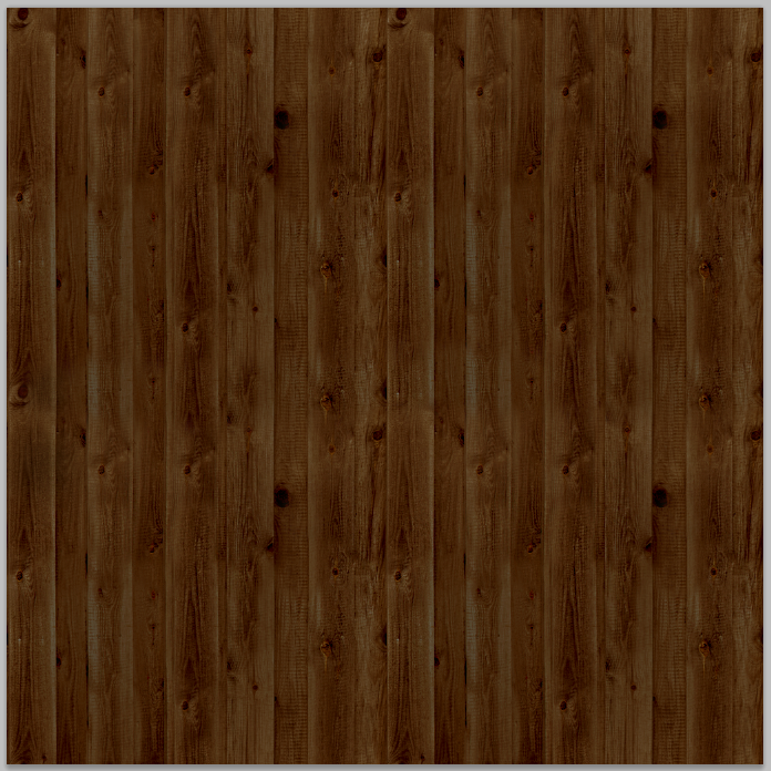
Texture after colour has been added using the image > adjustment s tools

9. Now test how the textures 'tiles' on a canvas double the height and width of the texture. For example create a 1024 x 1024 size canvas to 'test tile' a 512 x 512 size texture. Duplicate the texture until you have 4 of them and line them up to fill the canvas. Are there any obviously repeating patterns? if so return to the texture to fix it - if not save the texture file.


4 textures 'tiled' side by side - no obvious seams or patches

10. To save the texture, go to file > save as and select .TGA file (truevision targa) and then choose the 32 bit option when prompted.

Congratulations you have just created a seamless, tileable texture.

If you are using the texture in a 3D application then there is a little more work. For almost all 3D applications a the texture you have just created is still incomplete. A 'normal' file or 'heightmap' for the texture is still required. The quickest and easiest way to do this is using an application called CrazyBump which can be downloaded for free HERE.

Use crazy bump to create the 'normal' and if necessary (depending on the application you need the texture for) the occlusion, specularity and displacement files too. Once again save the files as .TGA (truevision targa) and choose the 32 bit option.