 |
| With so many colour variations to choose from settling on a colour scheme can be difficult |
A colour scheme is a combination of colours that, when put together, compliment or contrast one another in an aesthetically pleasing way. Colour schemes are used by artists, graphic designers and interior designers to create visually appealing imagery. Colour schemes can be put together at random, but most professionals choose colours based on their relationship to each other in the colour wheel. The colour scheme types explained here are monochromatic, primary, secondary, complimentary, analogous, triadic, warm and cool.
Monochromatic colour scheme:
 |
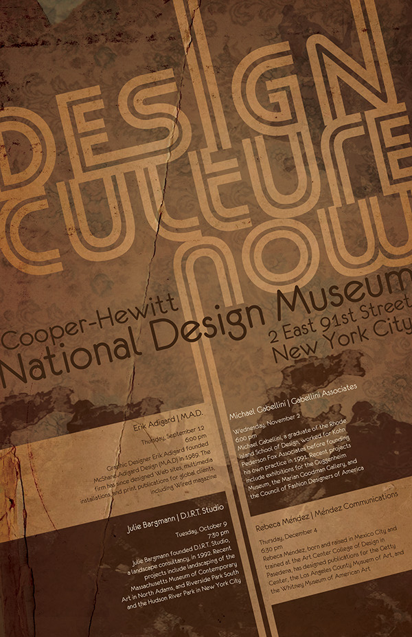
| Poster with a monochromatic colour scheme |
A monochromatic colour scheme is made up of just one main colour, but features a number of shades of that one colour. A simple example of this would be a colour scheme of blue, dark blue and light blue, as seen below. Monochromatic colour schemes could also feature the base colour, shades of that colour, and white and black.
Sample Monochromatic colour swatch
Primary Colour Scheme:
| Poster using primary colours |
This is another basic type of colour scheme where the basic primary colours of red, yellow and blue are used. A primary colour scheme can be made up of any shade of each primary colour but works best when the shades match evenly. In other words don't mix a bright red with a muted blue and yellow.
Sample Primary colour scheme
Secondary Colour Scheme:
 |
| Image with a secondary colour scheme |
This is a type of colour scheme where the secondary colours of purple, green and orange are used. A secondary colour scheme can be made up of any shade of each secondary colour but works best when the shades match evenly. In other words don't mix a bright purple with a muted green and orange.
Sample Secondary colour scheme
Complimentary Colour Scheme:
 |
| This images uses the complimentary colours of blue and orange |
Sample Complimentary colour scheme
Analogous Colour Scheme:
 |
| Poster using an analogous colour scheme |
An analogous colour scheme is created by pairing colours that appear side by side on the colour wheel. For example, an analogous colour scheme may include purple, blue and green. More subtle combinations may also be created by matching mixed colour tone combinations such as blue-purple, blue and blue-green, as seen below.
Analogous colour scheme
Triadic Colour Scheme:
 |
| This graphic design images uses a triadic colour scheme |
A triadic colour scheme is made up of three colours spaced evenly apart from each other on the colour wheel. The primary colour scheme made up of the primary colours--red, yellow and blue is an example of this. These colours are all an equal distance from each other on the colour wheel, and form a triangle on the colour wheel when connected to each other. To produce a different triadic colour scheme, move the triangle until it points to different colours on the colour wheel such as yellow, red-purple and blue-green.
Triadic colour scheme
Warm Colour Scheme:
| This movie poster uses a warm colour scheme |
The colour wheel is divided into two halves, warm colours and cool colours. The warm colours include reds, oranges and yellows, including all variations of these colours. The warm colours are associated with action, passion, love, rage, danger and heat.
Warm colour scheme
Cool Colour Scheme:
| This movie poster uses a cool colour scheme |
The cool colours are found on the opposite side of the colour wheel, and these colours include all blues, greens and purples. Cool colours are associated with coolness, peace, calm, depression,
sadness, sky and water.
Cool colour scheme