 |
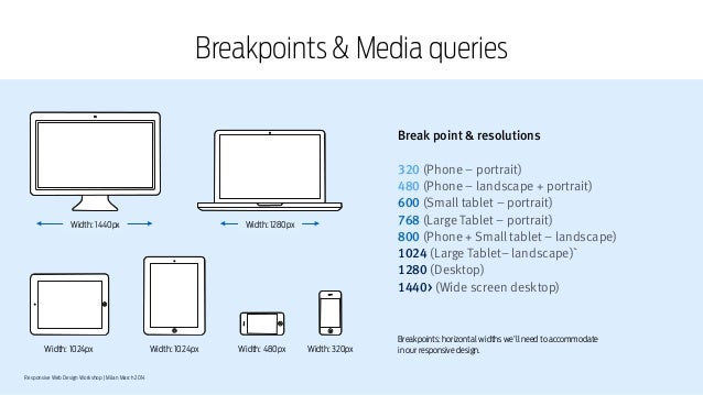
| Common device breakpoints |
At this point you have probably already heard about responsive web design and how every website needs to compatible to work well and look good across multiple devices. If so, you heard right!
With a @media query, you can write different CSS code for different screen sizes or for different devices, which is very useful when making web pages with responsive design. You can also have different layout when a user resizes a browser window up or down to a certain width, or height.
Responsive web design is vital for any web project and CSS media queries are vital for a successful responsive website. So to make things a little easier for you here are all the main CSS media queries need for a responsive website.
CSS Media Queries For a Responsive Website
/*Responsive Styles*/


/* Smartphones (portrait) ---------------- */
@media only screen
and (max-width : 320px)
{
/* Add Your CSS Styling Here */
}

/* Smartphones (landscape) ---------------- */
@media only screen
and (min-width : 321px)
and (max-width : 767px)
{
/* Add Your CSS Styling Here */
}

/* Tablets (portrait) -------------------- */
@media only screen
and (min-device-width : 768px)
and (max-device-width : 1024px)
and (orientation : portrait)
{
/* Add Your CSS Styling Here */
}


/* Tablets (landscape) ------------------- */
@media only screen
and (min-device-width : 768px)
and (max-device-width : 1024px)
and (orientation : landscape)
{
/* Add Your CSS Styling Here */
}

/* Old Desktops and laptops ------------------ */
@media only screen
and (min-width : 1025px)
{
/* Add Your CSS Styling Here */
}

/* Desktops ------------------ */
@media only screen
and (min-width : 1201px)
{
/* Add Your CSS Styling Here */
}
By inserting the relevant CSS code in each section you can have elements of your web page responding to the screen size or device orientation of your user.
More web tips,templates and tutorials coming soon as part of our "month of web" at OnlineDesignTeacher. Follow us on Twitter and Facebook to be sure you don't miss out.