 |
| What is responsive web design |
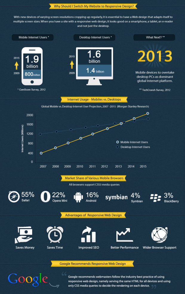
As shown in the graphic above, CSS3 is the final piece in the responsive puzzle. By specifying multiple CSS3 @media queries, you can write different CSS code for different screen sizes, different devices and even different device orientations (landscape or portrait).
By inserting the relevant CSS code in each section you can have elements of your web page resize, move or disappear according to the screen size or device orientation of your user. Responsive web design is vital for any web project and CSS media queries are vital for a successful responsive website.
So to make things a little easier for you here are all the main CSS media queries need for a responsive website.
CSS Media Queries For a Responsive Website
/*Responsive Styles*/


/* Smartphones (portrait) ---------------- */
@media only screen
and (max-width : 320px)
{
/* Add Your CSS Styling Here */
}

/* Smartphones (landscape) ---------------- */
@media only screen
and (min-width : 321px)
and (max-width : 767px)
{
/* Add Your CSS Styling Here */
}

/* Tablets (portrait) -------------------- */
@media only screen
and (min-device-width : 768px)
and (max-device-width : 1024px)
and (orientation : portrait)
{
/* Add Your CSS Styling Here */
}


/* Tablets (landscape) ------------------- */
@media only screen
and (min-device-width : 768px)
and (max-device-width : 1024px)
and (orientation : landscape)
{
/* Add Your CSS Styling Here */
}

/* Old Desktops and laptops ------------------ */
@media only screen
and (min-width : 1025px)
{
/* Add Your CSS Styling Here */
}

/* Desktops ------------------ */
@media only screen
and (min-width : 1201px)
{
/* Add Your CSS Styling Here */
}
